¶ 00visual identity · living guide
One world, many landscapes.
The identity of Gustavo Rodrigues: a small world drawn as a technical plate — paper, ink and a single color, the red of the rubric. It applies to the portfolio, to Capela de Estudos and to whatever comes next.
fig. 2 — the mark over its own construction
Where each thing comes from
Nothing here is loose decoration: every element tells a piece of the same story.
01
The sky
The Southern Cross is the sky over Londrina, the cross of those who are Christian and the star of those who navigate. In Fig. 1, ideas fall from it: faith comes before the work.
02
The workshop
The idea falls down the chimney and becomes code. The workshop is the work: bench, forge, gears. It’s where care lives.
03
The orbit
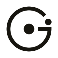
What leaves the workshop goes into orbit: artifacts in production. The mark is exactly that — a G made of an orbit, with the core at the center and a satellite heading out.
04
The rubric
Red is the ink of the rubricators, who opened the paragraphs of liturgical manuscripts with a red ¶ — and it is also the ember of the forge. Reason and faith in the same color.
The mark
The open orbit draws the G. The bar points to the core — the world, the person. The satellite sits in the mouth of the G: the work heading out. Each landscape swaps only the satellite.
Satellite
workshop — portfolio, résumé, project signature
Star
chapel — Capela de Estudos, writing on faith
Artifact
lab — studies and experiments, once it exists
rules
Minimum clear space of ¼ of the mark’s width around it.
Minimum size of 16 px — the satellite must stay visible.
One satellite only, always in the mouth of the G. Never rotate the whole G.
In one color, the satellite follows the ink. In color, it is rubric (day) or ember (night).




Colors
Everything is paper and ink. The only color is red — rubric by day, ember by night, tuned to keep contrast in both. The blue cyanotype appears only on what is still on the drawing board; the Capela wears the same red on limewash and stone, with a hidden gold that only shows up close.
Paper
day surface
#EEEAE0
Ink
day text and line
#17150F
15.2:1 AA
Rubric
the accent, by day
#B5321C
5.1:1 AA
Graphite
secondary text
#57524A
6.4:1 AA
Night
night surface
#14120E
Parchment
night text
#ECE6D9
15.0:1 AA
Ember
the accent, by night
#EE5C3F
5.6:1 AA
Cyanotype
only what is on the drawing board
#2E4A7D
7.3:1 AA
Gold
the hidden gold of Capela de Estudos
#7E5F28
5.2:1 AA
Typography
Bricolage Grotesque
headings and text. “Bricolage” is workbench tinkering — the voice of the workshop.
Software, carefully made
Cormorant Garamond italic
the word that matters. One per sentence, in the accent color. The same serif as the Capela.
care
IBM Plex Mono
annotations: rubrics, captions, spec sheets, coordinates.
¶ 02career
fig. 1 — gustavo’s world, orbital view · 23°18′S 51°09′W
Graphic elements
The devices of a technical plate and of a manuscript, used sparingly: one or two per block at most.
¶ 03artifacts
Rubric
The red ¶ opens each section — in the manuscript and in the code editor.
Hatching
Engraving shade, for the night side and for filling without color.
Registration marks
Print corners mark sheets and important figures.
Artifact seal
Each project gets a unique seal, generated from its own name.
- in productionin progresson the drawing board
Status
The state of each artifact, always in the same vocabulary.
- author
- G. R. Fabiano
- rev.
- 2026.10
Title block
Facts stated as part of the composition: author, place, revision.
Motion and voice
The metaphor lives in the margins — rubrics, captions, labels. Titles and content stay literal: a reader in a hurry understands everything without knowing the world.
motion
- 01
Slow orbit
Ambient motion is linear and slow: 40 to 70 seconds per revolution.
- 02
One per page
Only one protagonist animation per page — Fig. 1. Everything else moves only by the reader’s hand.
- 03
Plotted on scroll
As you scroll, the page is plotted: lines are traced, orbits open out and blocks rise, once. Nothing loops.
- 04
Precision
The interface responds in 150–200 ms, with no springs or bounces: an underline being traced, a rule turning red.
- 05
Brand gesture
Only brand objects make a longer gesture, once: the satellite makes one orbit, the seal turns.
- 06
Always pausable
A visible pause button, and anyone who asks for less motion gets the page still and complete.
vocabulary
- artifact
- a delivered project
- workshop
- where things are built — the portfolio
- chapel
- where one studies and prays — Capela de Estudos
- orbit
- in production, in use
- drawing board
- planned, not started yet
- care
- the quality bar — “capricho” in Portuguese
Portuguese first in everything that is read — the portfolio, the résumé and this guide also have this English edition, where “capricho” becomes care. English in everything that is coded. One italic word per sentence — the one that matters.